UX Client Project
Scarborough Centre for Healthy Communities came to our group for assistance on their current website. As a part of my Advanced UX Design class, we were tasked with client meetings to understand what they were looking for, research, interviews, usability tests, and a working prototype over the course of a semester.
Scarborough Centre for Healthy Communities
About:
Scarborough Centre for Healthy Communities was looking to understand their audience and why they are visiting the website. They are aware that the three key offerings are volunteers, donations and finding medical resources like doctors. They are unsure if users are able to find this information easily, whether or not they are able to understand the information, and how many times each user returns to the site. SCHC is looking for UX/UI designers to attract donors, volunteers, and prospective clients with a professional and direct site. My team and I have spent the past few months researching and interviewing to discover what consumers were really looking for, and the best way to present that information.
Objective:
Direct visitors as easily as possible to their goal, especially for SCHC's key topics: programs, volunteers, and donations
Process:
1) Heuristic Analysis
Looked at the site holistically to analyze, and establish opinions based on multiple characteristics. Based on this we
determined that the site looked busy at times with rotating images, and rolling text. In addition,
we determined that specific call-to-actions were not always well marked, and the navigation was not user friendly.
2) Comparative Analysis
Studied how competitors and/or similar programs had their websites and displayed their offerings. Based on the layout
of these sites, we established a plan to make SCHC’s site comparable and up-to-date.
3) In-Depth Interviews
Interviewed 15 different types of people based on our three main goals: donators, volunteers, and an example of a
program (questioned about assisted living). Our findings are highlighted in these hypotheses based on trends we
noticed during interviews.
4) Personas
We developed our personas from user interviews focusing on certain pain points that many users typically faced.
Again, these three personas were developed based on the three user goals: volunteer, donate, and programs.
5) Card Sort
For this test we tested over 30 people virtually where they individually categorized the pages provided. For the
purposes of this project, we ran an open card sort, which allowed them to name the categories they created. Based on
the results, we compiled their results and determined what would make the most sense to an average user.
6) Storyboard
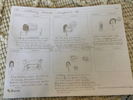
Created a storyboard to visually layout how our target personas would come in contact with SCHC and the
uses/pathway of the site to achieve their goals. Based on these storyboards, we gained deeper insights into the main
uses of the site and were able to reconfigure certain aspects before prototyping.
7) Wireframe
Created drawings of what different landing pages and example pages could look like after both research and testing.
After each member drew multiple versions, we narrowed our options to develop one consistent design.
8) Clickable Prototype
Created an interactive mock-up of our new design proposal for the website using Axure RP software. We expanded
on our wireframes and created pages to represent all of the changes we suggested for the site.
9) Usability Test
Following the design of the overall site; user tests were run to test the overarching goals and ensure that the
redesign was successful. Based on these results, we changed aspects like placement, font size, organization, and overall
consistency in the layout.
Personas & Storyboards
Personas (above):
After interviewing prospective customers based on the three key topics, our team developed personas to reflect someone who would encounter each of these pages. Persona 1 focuses on someone moving and looking to donate furniture, persona 2 is an adult looking for assisted living for her aging mother, and persona 3 is a volunteer looking to give back to his community. These personas highlight specific pain points that the average consumer may face upon accessing SCHC's website.
Storyboards (above):
Following the creation of the personas, we developed storyboards that showed how the personas would come across the site, and their interaction with the non-profit.
Early Concepts & Sketches:
Sketches:
Following the creation of the personas, we developed storyboards that showed how the personas would come across the site, and their interaction with the non-profit.
Wireframes:
After each member on my team drew different examples of a sample homepage and donation page, we met and discussed what aspects we liked from each drawing. Then, we decided what to use for the redesign, how different features could be implemented, etc. Once the decision was made for a specific look, we finalized the design with a single drawing to combine our ideas.


Following the finalized sketch, we developed a basic wireframe for each page we changed. These included placement text, and designated spots for images.
This was made through the program Axure RP.


Feedback and Iteration:
Quotes From User Tests:
“Organized, which makes it easy to find stuff”
“Yellow boxes jumped out and I wanted to read them first”
“Pleasant mix of colors”
“Very clean and simple to use”
“Easy to navigate with the navigation bar”
“Very clean and well organized”
“Eye-catching”
“Good layout”
Final Prototype:
Revisions Following User Tests:
While we received great feedback regarding the re-design, there were some revisions that were needed due to visibility from text size, image and text placement, and overall cohesiveness. After adjusting the pages and changing the layouts, we finalized the prototype for the client.
Major Changes From the Original:
1) Blog Rebrand
One of the things we noticed when redesigning the site was the availability of the blog, both in placement and in
content. Therefore, a major change we decided to make was a redesign of the blog. This included changing the name
and reconceptualizing the organization to increase brand awareness. The new name is Four Square, developed from
their logo, and the blog articles will be categorized by SCHC's five core values: community engagement, inclusiveness,
accountability, respect, and equity.
2) Calendar
Based on user tests, and comparable calendars found from the comparative analysis we decided to revamp the
overall look and feel of the calendar to reduce cluttering and to cut back on the overwhelming amount of content.
We decided to adjust the calendar by presenting the information day by and in chronological order.
1) Client Portal
Something our team recognized when we first combed through the site was the placement of three buttons: client
feedback, client payment, and client survey. Because of this, we decided to add these pages into our card sort, in
which our test subjects categorized these pages into the navigation bar under the title client portal. This feature
allows for frequent clients to easily navigate the site and prevents the feeling of misplacement.
2) Navigation Bar & Consolidation
We used an open card sort to develop a more logical pathway for users, where they took different landing pages
provided and categorized them into groups they would see on a navigation bar. After grouping, they were allowed to
name the category. These results were then combined and my team looked for similarities. Following this process, we
consolidated pages that were misplaced, or too short.
Outcome:
The client was very excited with the overall new look and feel of the website. SCHC asked how we had come to certain conclusions, bringing up results from our usability tests and in-depth interviews. Following this project, Scarborough Centre for Healthy Communities will be implementing our concepts and proposed layout onto their website.


